# Behavior
Blazor Edition provides a set of native UI controls built for Blazor such as FlexGrid, Chart, ListView, and input controls including AutoComplete and ComboBox.
## Content
Window offers various properties to determine the behavior of the Window control. These behaviors include window's draggability, resizability, positioning, and overlay. Get to know more about these behaviors and how to set them for the Window control in the following sections.
## Draggable Window
The Window control allows you to move the popup window just by clicking the Window's header and drag it around the screen. To drag the popup window around the screen, you can set [IsDraggable](/componentone/api/blazor/online-blazor/dotnet-api/C1.Blazor.Input/C1.Blazor.Input.C1Window.IsDraggable.html) property of the [C1Window](/componentone/api/blazor/online-blazor/dotnet-api/C1.Blazor.Input/C1.Blazor.Input.C1Window.html) class to **true**.
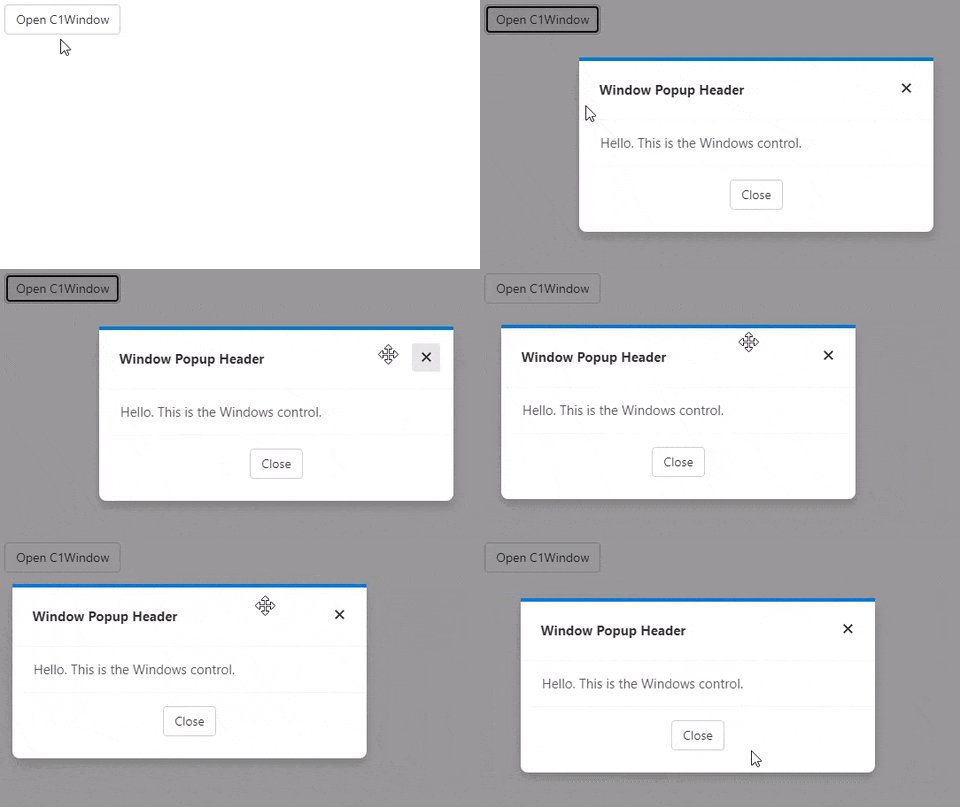
To allow user to drag the Window at runtime, the following code:
```razor
Window Popup HeaderHello. This is the Windows control.
@code{
C1Window myPopup;
void OpenPopup()
{
myPopup.Open();
}
void ClosePopup()
{
myPopup.Close();
}
}
```
## Resizable Window
Window can be resized simply by dragging its borders in the desired direction. It lets you control its resizability using only one property, i.e., [IsResizable](/componentone/api/blazor/online-blazor/dotnet-api/C1.Blazor.Input/C1.Blazor.Input.C1Window.IsResizable.html) property of the **C1Window** class.
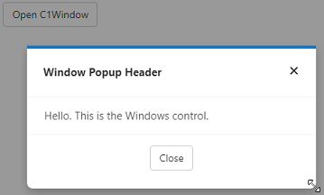
To allow a user to change the size of the Window at runtime, you can set the **IsResizable** property to **true** as shown in the following code:
```razor
Window Popup HeaderHello. This is the Windows control.
@code{
C1Window myPopup;
void OpenPopup()
{
myPopup.Open();
}
void ClosePopup()
{
myPopup.Close();
}
}
```
## Overlay
Sometimes, you might need bring the popup window into focus by adding an overlay effect to the browser. This overlay effect helps in bringing contrast between the popup window and the background by either adding a black tint to the background or blurring it. Window supports overlays and allows you to use the dark overlay at runtime. By default, the dark themed overlay is set for Windows. However, you can choose not to use it for Windows by setting [IsDarkOverlay](/componentone/api/blazor/online-blazor/dotnet-api/C1.Blazor.Input/C1.Blazor.Input.C1Window.IsDarkOverlay.html) property of the **C1Window** class to **false**.
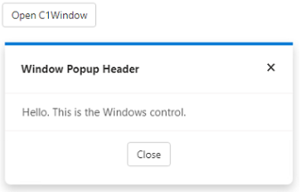
The following code showcases how you can use the **IsDarkOverlay** property to remove the dark themed overlay:
```razor
Window Popup HeaderHello. This is the Windows control.
@code{
C1Window myPopup;
void OpenPopup()
{
myPopup.Open();
}
void ClosePopup()
{
myPopup.Close();
}
}
```
## Popup Window Position
In addition to dragging and resizing, you can also set the position of the popup window to display on the screen. You can choose to change the position of the Window with respect to the owner element or target using [Position](/componentone/api/blazor/online-blazor/dotnet-api/C1.Blazor.Input/C1.Blazor.Input.C1Window.Position.html) property of the **C1Window** class. The **Position** property sets the position of the Window using the [PopupPosition](/componentone/api/blazor/online-blazor/dotnet-api/C1.Blazor.Input/C1.Blazor.Input.PopupPosition.html) enumeration.
Note that you always need to set the target first in order to change the position of the Window.
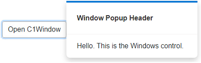
The following code demonstrates how to change the position of the Window:
```razor
Window Popup Header
Hello. This is the Windows control.
@code{
C1Window myPopup;
void OpenPopup()
{
myPopup.Open();
}
void ClosePopup()
{
myPopup.Close();
}
}
```