# Appearance and Style

Blazor Edition provides a set of native UI controls built for Blazor such as FlexGrid, Chart, ListView, and input controls including AutoComplete and ComboBox.

## Content


Window for Blazor provides various options to customize the appearance of the Window and all its elements individually, so that you can style and display it as per your requirement. In the following example, we changed the background color, font color, font-family, font-size and font-weight of the Window elements to make changes in the look and appearance of the Window.
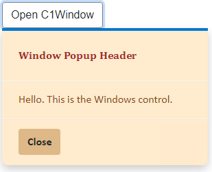
![Custom appearance of Windows in Blazor](https://cdn.mescius.io/document-site-files/images/f5b600ba-f1a7-4f89-a20c-aa6c0c35880d/images/window-styling.png)

The following code demonstrates how you can style the Window control:

```EXAMPLE
<button class="btn btn-default" id="btn" @onclick="@OpenPopup" style="border-color:gray">Open C1Window</button>
<C1Window @ref="myPopup" Target="btn"
          Style="@("width: 300px; background-color:blanchedalmond; color:saddlebrown; font-family:Calibri")">
    <PopupHeader>
        <div style="font-size:medium; color:brown; font-family:Cambria;">Window Popup Header</div>
    </PopupHeader>
    <PopupContent>Hello. This is the Windows control.</PopupContent>
    <PopupFooter>
        <button class="btn btn-default" @onclick="@ClosePopup"
                style="font-weight:bold; background-color:burlywood;">
            Close
        </button>
    </PopupFooter>
</C1Window>
@code{
    C1Window myPopup;
    void OpenPopup()
    {
        myPopup.Open();
    }
    void ClosePopup()
    {
        myPopup.Close();
    }
}
```