# Dialogs and Popups
Blazor Edition provides a set of native UI controls built for Blazor such as FlexGrid, Chart, ListView, and input controls including AutoComplete and ComboBox.
## Content
Window shows arbitrary HTML content next to an "owner" element or centered on the screen. It can be used to implement dialogs and popups. Let us get to know more about the dialogs, it's type and popups in the following sections.
## Dialog
A dialog is a popup without an owner element. You can use the dialogs for alerts or prompts. The Dialog allows you to enter or edit information without switching to a new page or view. It gets dismissed when the user presses the Escape key or when the dialog loses focus.
The [C1Window](/componentone/api/blazor/online-blazor/dotnet-api/C1.Blazor.Input/C1.Blazor.Input.C1Window.html) class provides [DialogType](/componentone/api/blazor/online-blazor/dotnet-api/C1.Blazor.Input/C1.Blazor.Input.C1Window.DialogType.html) property to set the result type of a dialog using the [DialogType](/componentone/api/blazor/online-blazor/dotnet-api/C1.Blazor.Input/C1.Blazor.Input.DialogType.html) enumeration. The **DialogType** enumeration lets you set either of the two result types for the dialog, Prompt or Confirm.
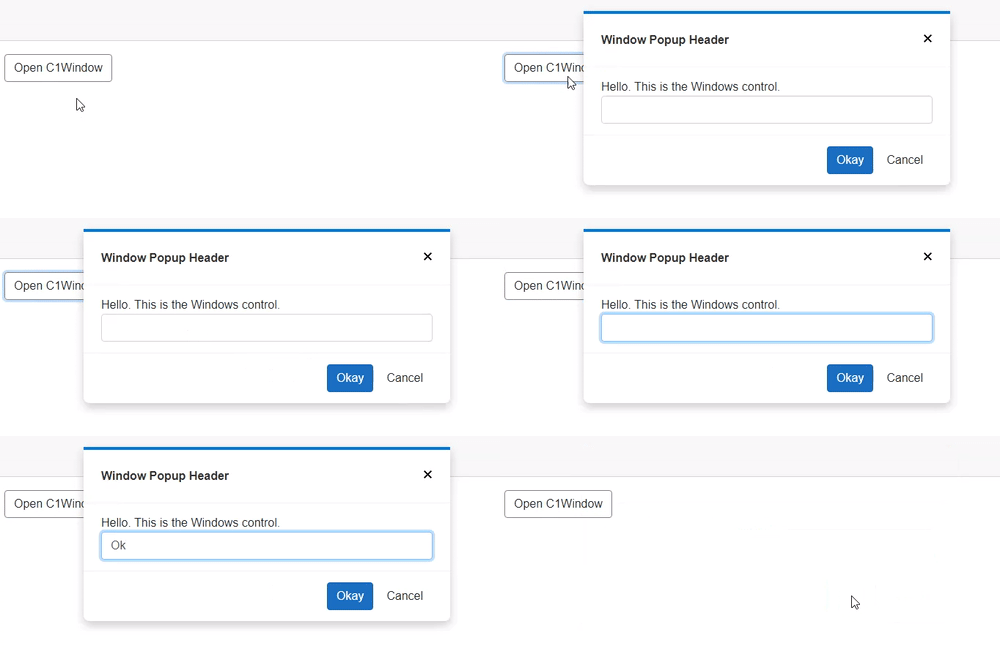
The following code demonstrates how you can create a prompt dialog:
```razor
Window Popup Header
Hello. This is the Windows control.
@code{
C1Window myPopup;
void OpenPopup()
{
myPopup.Open();
}
void ClosePopup()
{
myPopup.Close();
}
}
```
## Popup
Popups are bound to an owner element that controls their position and visibility. Such popups with owners are also called Popovers. The display behavior of a Popover can be manipulated using the [OpenTrigger](/componentone/api/blazor/online-blazor/dotnet-api/C1.Blazor.Input/C1.Blazor.Input.C1Window.OpenTrigger.html) and [CloseTrigger](/componentone/api/blazor/online-blazor/dotnet-api/C1.Blazor.Input/C1.Blazor.Input.C1Window.CloseTrigger.html) properties which allows you to control the actions that cause the popup to appear and disappear. These trigger actions are defined by the [PopupTrigger](/componentone/api/blazor/online-blazor/dotnet-api/C1.Blazor.Input/C1.Blazor.Input.PopupTrigger.html) enumeration.
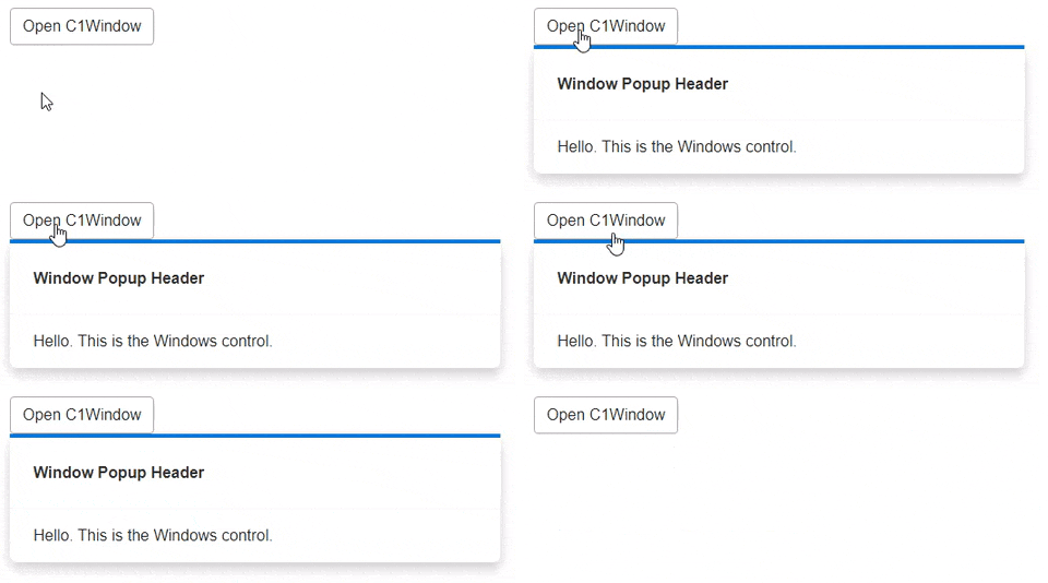
You can use the **OpenTrigger** and **CloseTrigger** properties to determine whether the Popup should be shown or hidden when the owner element (button in this case) is clicked, or when the popup loses the focus.
```razor
Window Popup Header
Hello. This is the Windows control.
@code{
C1Window myPopup;
void OpenPopup()
{
myPopup.Open();
}
void ClosePopup()
{
myPopup.Close();
}
}
```