# Tooltip
Blazor Edition provides a set of native UI controls built for Blazor such as FlexGrid, Chart, ListView, and input controls including AutoComplete and ComboBox.
## Content
Tooltips are a commonly used method to show informative descriptions for an object to the end users of an application. They are a very effective and straight forward way to add more information to the target elements, without overloading the user. **Tooltip for Blazor** is a floating popup that appears when the user moves the mouse over target elements. It is represented by the [C1Tooltip](/componentone/api/blazor/online-blazor/dotnet-api/C1.Blazor.Input/C1.Blazor.Input.C1Tooltip.html) class which provides various properties to manipulate the tooltip. By default, tooltips are positioned above the target element. However, you can change that by specifying the position where the tooltip should appear.
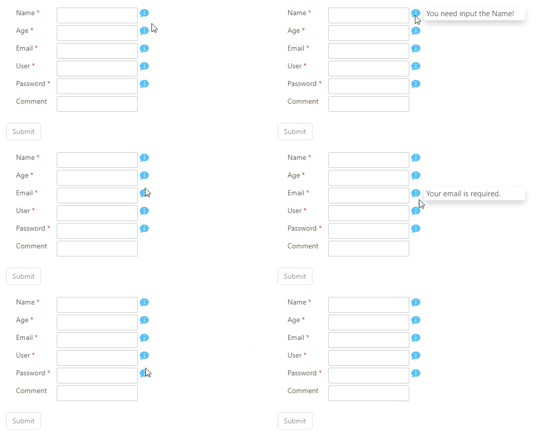
Make the most of **Tooltip** by taking advantage of the following key features:
* **Display additional information**
Tooltip enables you to display additional information related to the target element when you hover over it.
* **Tooltip position**
Tooltip supports twelve different positions to display a tooltip around the target element. These positions are above, above left, above right, below, below right, below left, right, right top, right bottom, left, left top, and left bottom.