# Scroll Behavior
Blazor Edition provides a set of native UI controls built for Blazor such as FlexGrid, Chart, ListView, and input controls including AutoComplete and ComboBox.
## Content
RangeSlider allows you to handle how the thumbs move on the slider track when a click is performed outside the selected range. By default, only the closest thumb moves along the slider track when the slider track is clicked outside the selected range. However, you can change this default behavior with the help of [ScrollBehavior](/componentone/api/blazor/online-blazor/dotnet-api/C1.Blazor.Input/C1.Blazor.Input.C1RangeSlider.ScrollBehavior.html) property of the [C1RangeSlider](/componentone/api/blazor/online-blazor/dotnet-api/C1.Blazor.Input/C1.Blazor.Input.C1RangeSlider.html) class. The **ScrollBehavior** property lets you drag each thumb individually or drag the center to move both thumbs at the same time using the [RangeSliderScrollBehavior](/componentone/api/blazor/online-blazor/dotnet-api/C1.Blazor.Input/C1.Blazor.Input.RangeSliderScrollBehavior.html) enumeration. The **RangeSliderScrollBehavior** enumeration provides the following options to handle the movement of the LowerValue and UpperValue thumbs on the slider track of the RangeSlider control:
| **Enumeration Value** | **Description** |
| --- | --- |
| **None** | Stops the movement of both the thumbs. |
| **Range** | Moves both the thumbs in the direction of mouse by a large distance. |
| **Thumb** | Moves the closest thumb in the direction of mouse by a large distance. This is the default behavior of the control. |
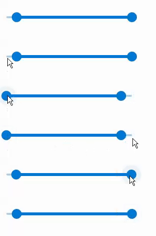
The following GIF shows how the RangeSlider behaves after setting the **ScrollBehavior** property to **Range**.
|  |
| --- |
To change the movement behavior of the LowerValue and UpperValue thumbs, use the following code. This example uses the sample created in the [Range](/componentone/docs/blazor/online-blazor/controls/input-controls/rangeslider/rangeslider-range) topic.
```razor
```