# Range

Blazor Edition provides a set of native UI controls built for Blazor such as FlexGrid, Chart, ListView, and input controls including AutoComplete and ComboBox.

## Content


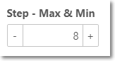
You can set up the range of the maximum and minimum value that can be entered in a NumericBox control using [Max](/componentone/api/blazor/online-blazor/dotnet-api/C1.Blazor.Input/C1.Blazor.Input.C1NumericBox-1.Max.html) and [Min](/componentone/api/blazor/online-blazor/dotnet-api/C1.Blazor.Input/C1.Blazor.Input.C1NumericBox-1.Min.html) properties of the [C1NumericBox](/componentone/api/blazor/online-blazor/dotnet-api/C1.Blazor.Input/C1.Blazor.Input.C1NumericBox-1.html) class.
![NumericBox control with specified range](https://cdn.mescius.io/document-site-files/images/f5b600ba-f1a7-4f89-a20c-aa6c0c35880d/images/maxmin.png)

The following code example demonstrates setting maximum and minimum values in NumericBox. In this example, we set the maximum value as "10" using the **Max** property and minimum value as "0" using the **Min** property.

```razor
<label>Step - Max & Min</label>
<div>
    <C1NumericBox Format="##,###.##" Placeholder="Any Text" Style="@_c1Style" TNumeric="double?" Step="2" Max="10" Min="0"></C1NumericBox>
</div>
```

```razor
@code{
    double? _value;
    readonly C1Style _c1Style = new C1Style() { Width = 130 };
    readonly C1Style _customStyle1 = new C1Style() { Width = 230, Height = 45, BorderColor = "orange", BorderWidth = 1, };
    readonly C1Style _customStyle2 = new C1Style() { Width = 230, Height = 55, BorderColor = "green", BorderWidth = 3, };
    readonly C1Style _customStyle3 = new C1Style() { Width = 270, Height = 65, BorderColor = "violet", BorderWidth = 5, };
    private void HandleValueChanged(object sender, C1NumericBoxEventArgs e)
    {
        _value = (double?)e.Value;
        StateHasChanged();
    }
}
```