# Masked Text Box
Blazor Edition provides a set of native UI controls built for Blazor such as FlexGrid, Chart, ListView, and input controls including AutoComplete and ComboBox.
## Content
Validate input in your applications using **MaskedTextBox for Blazor**, an advanced data entry control. MaskedTextBox provides a text box with a mask that automatically validates entered input and prevents users from entering invalid characters. When you add the MaskedTextBox control to your application, it exists as a completely functional text box which includes a basic text input area and can be further customized with a mask.
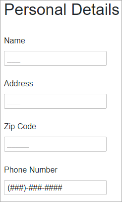
Make the most of **MaskedTextBox** by taking advantage of the following key features:
* **Validate Data and Enhance Your UI**
MaskedTextBox provides input validation and format how the text is displayed with mask validation that automatically validates the input. It prevents end-users from entering invalid characters into the control. See [Masks](/componentone/docs/blazor/online-blazor/controls/input-controls/maskedtextbox/maskedtextbox-mask-types) topic for details.
* **Include Prompts and Literals**
Choose whether or not to show prompt characters and literals by simply setting one property. For detailed information and implementation of the prompts and literals, see [Prompts and Literals](/componentone/docs/blazor/online-blazor/controls/input-controls/maskedtextbox/maskedtextbox-prompts-literals) topic for details.
* **Placeholder Support**
MaskedTextBox allows you to add placeholder to provide contextual clues to let end-users know what type of information is expected. The placeholder is displayed in the control while no text has been entered. See [Placeholder](/componentone/docs/blazor/online-blazor/controls/input-controls/maskedtextbox/maskedtextbox-placeholder) topic for details.