# Radial Gauge Features
Blazor Edition provides a set of native UI controls built for Blazor such as FlexGrid, Chart, ListView, and input controls including AutoComplete and ComboBox.
## Content
The **Radial Gauge** control uses a rotating indicator or pointer to display the value along a radial scale. Just like Linear Gauge, the value is represented in a Radial Gauge using the [Value](/componentone/api/blazor/online-blazor/dotnet-api/C1.Blazor.Gauge/C1.Blazor.Gauge.C1Gauge.Value.html) property and the range is defined by the [Min](/componentone/api/blazor/online-blazor/dotnet-api/C1.Blazor.Gauge/C1.Blazor.Gauge.C1Gauge.Min.html) and [Max](/componentone/api/blazor/online-blazor/dotnet-api/C1.Blazor.Gauge/C1.Blazor.Gauge.C1Gauge.Max.html) properties. The **Min** property sets the minimum value of the gauge, while the **Max** property sets the maximum value of the gauge. In addition, the current, maximum and minimum values can be displayed as text in gauges using the [TextVisibility](/componentone/api/blazor/online-blazor/dotnet-api/C1.Blazor.Gauge/C1.Blazor.Gauge.C1Gauge.TextVisibility.html) property and the interval of the values can be set using the [Step](/componentone/api/blazor/online-blazor/dotnet-api/C1.Blazor.Gauge/C1.Blazor.Gauge.C1Gauge.Step.html) property. For more information about the Value, Step, TextVisibility, Min and Max properties, see [Linear Gauge Features](/componentone/docs/blazor/online-blazor/controls/gauges-overview/linear-gauge-features) topic.
The following code demonstrates how to set the **Value**, **Step**, **TextVisibility**, **Min** and **Max** properties for the Radial Gauge control.
```razor
```
## AutoScale Gauge
The Radial Gauge control also provides the [AutoScale](/componentone/api/blazor/online-blazor/dotnet-api/C1.Blazor.Gauge/C1.Blazor.Gauge.C1RadialGauge.AutoScale.html) property in the [C1RadialGauge](/componentone/api/blazor/online-blazor/dotnet-api/C1.Blazor.Gauge/C1.Blazor.Gauge.C1RadialGauge.html) class, which when set to true, automatically scales the Radial Gauge to fill its containing element as shown in the following image.
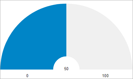
The following code shows how to set the **AutoScale** property:
```razor
```
## Reverse Gauge
The RadialGauge control has a default clockwise direction, in which the value changes across the radial frame over the time. However, you can reorient the radial gauge so that it is drawn reversed (counter-clockwise) using the [IsReversed](/componentone/api/blazor/online-blazor/dotnet-api/C1.Blazor.Gauge/C1.Blazor.Gauge.C1RadialGauge.IsReversed.html) property.
The following image showcases reversed Radial Gauge control.
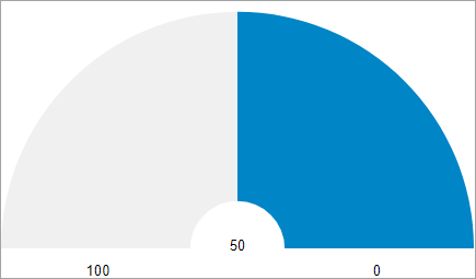
The following code shows how to set a reversed Radial Gauge:
```razor
```
## Start and Sweep Angle
The radial frame or scale of the Radial Gauge control can be rotated using the [StartAngle](/componentone/api/blazor/online-blazor/dotnet-api/C1.Blazor.Gauge/C1.Blazor.Gauge.C1RadialGauge.StartAngle.html) and [SweepAngle](/componentone/api/blazor/online-blazor/dotnet-api/C1.Blazor.Gauge/C1.Blazor.Gauge.C1RadialGauge.SweepAngle.html) properties. The **StartAngle** property sets the starting angle for the gauge, in degrees, and the **SweepAngle** specifies the rotation added to the StartAngle, in degrees, when the Value property is set to the Maximum value in the range.
The following image shows a Radial Gauge with a start angle of '-10 degrees' and sweep angle of '200 degrees'.
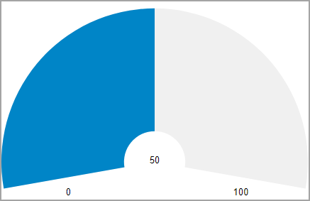
The following code shows how to set StartAngle and SweepAngle:
```razor
```