# Transposed Grid
Blazor Edition provides a set of native UI controls built for Blazor such as FlexGrid, Chart, ListView, and input controls including AutoComplete and ComboBox.
## Content
In regular grids, each item is represented by a row with columns that represent the item properties. Whereas, in transposed grids, each item is represented by a column with rows that represent the item properties. TransposedGrid is a FlexGrid extension that supports a grid where the rows and columns are transposed. FlexGrid for Blazor supports a transposed view where the column headers appear on the left side and rows display horizontally. This transposed feature can be enabled by the [TransposedGridBehavior](/componentone/api/blazor/online-blazor/dotnet-api/C1.Blazor.Grid/C1.Blazor.Grid.TransposedGridBehavior.html) class which allows the grid to display data using a transposed layout, where columns represent data items and rows represent item properties.
The following image showcases a grid displaying data in transposed layout:
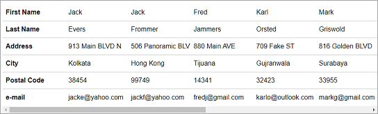
To transpose columns and rows so the data items are shown as columns, use the following code. This example uses the Customer.cs class available in the BlazorExplorer product sample to display data in the grid.
```razor
@using C1.Blazor.Grid
@using C1.Blazor.Input
@using C1.Blazor.Core
@using System.Collections.ObjectModel;
@code {
ObservableCollection customers;
protected override void OnInitialized()
{
customers = Customer.GetCustomerList(10);
}
}
```