# Column Sizing
FlexGrid can be responsively sized where the column widths can adjust automatically to fill the entire available space irrespective of the browser and device.
## Content
FlexGrid can be responsively sized where the column widths can adjust automatically to fill the entire available space irrespective of the browser and device.
You can define the size of columns of FlexGrid using [GridLength](/componentone/api/blazor/online-blazor/dotnet-api/C1.Blazor.GridControl/C1.Blazor.Grid.GridLength.html) _struct_ and assigning the [Star](/componentone/api/blazor/online-blazor/dotnet-api/C1.Blazor.GridControl/C1.Blazor.Grid.GridLength.Star.html) property to set the the width of each column automatically with respect to available screen space. This avoids horizontal scrolling and display the entire data on the screen.
The image below shows how the FlexGrid appears, after star and auto sizing are applied to columns.
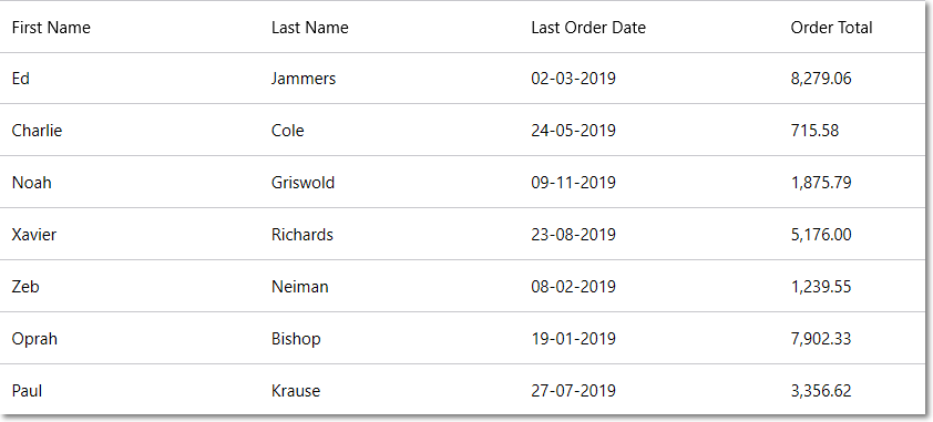
The following **code example** demonstrates sizing in FlexGrid where the **Star** property is assigned to set the default column width in the grid. This example uses the Customer.cs class available in the BlazorExplorer product sample.
```razor
@page "/FlexGrid/ResponsiveSizing"
@using System.Collections.ObjectModel;
@using C1.Blazor.Core
@using C1.Blazor.Grid
@code {
ObservableCollection customers;
protected override void OnInitialized()
{
customers = Customer.GetCustomerList(100);
}
}
```