# Elements
Blazor Edition provides the DateTimePicker control, combination of a date picker and a time picker. Learn more about DateTimePicker and its elements in the Blazor documentation.
## Content
**DateTimeEditors for Blazor** includes the DateTimePicker control, a simple control which provides, by default, both a date picker and a time picker. The interface of the DateTimePicker looks similar to the following image:
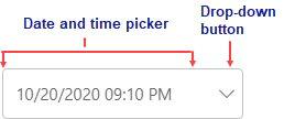
The **DateTimePicker** control consists of the following elements:
* **Date and Time Picker**
The date and time picker element is comprised of a date and time field. You can set the date by entering numeric values or by selecting a date from the calendar and set the time from the time panel.
* **Drop-Down Button**
The drop-down button opens a calendar with time panel from where you can select a date and time to display in the date and time picker.