# Styling and Appearance
Style and customize the appearance of the DateTimePicker control. Learn more about customizing the appearance of the DateTimePicker control in Blazor documentation.
## Content
DateRangePicker provides various options to customize the appearance of the DateRangePicker control and all its elements individually, so that you can style and display the DateRangePicker control as per your requirement. You can style the DateRangePicker using the **Style** property and its elements using several properties such as [HeaderStyle](/componentone/api/blazor/online-blazor/dotnet-api/C1.Blazor.DateTimeEditors/C1.Blazor.DateTimeEditors.C1DateTimeBase-1.HeaderStyle.html), [CalendarStyle](/componentone/api/blazor/online-blazor/dotnet-api/C1.Blazor.DateTimeEditors/C1.Blazor.DateTimeEditors.C1DateTimeBase-1.CalendarStyle.html), [TodayStyle](/componentone/api/blazor/online-blazor/dotnet-api/C1.Blazor.DateTimeEditors/C1.Blazor.DateTimeEditors.C1DateTimeBase-1.TodayStyle.html), [SelectedDateStyle](/componentone/api/blazor/online-blazor/dotnet-api/C1.Blazor.DateTimeEditors/C1.Blazor.DateTimeEditors.C1DateTimeBase-1.SelectedDateStyle.html), **DropDownBehavior** etc., which offers different ways of styling and customizing the appearance of the DateRangePicker control along with all its elements such as drop-down button, header, calendar, etc.
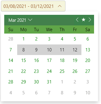
The following code demonstrates the use of the available styling and appearance customization properties change the appearance of the DateRangePicker control:
```razor
```