# Day and Date Range
Blazor Edition provides a set of native UI controls built for Blazor such as FlexGrid, Chart, ListView, and input controls including AutoComplete and ComboBox.
## Content
In addition to changing date formats, DateRangePicker allows you to customize the dropdown calendar to show a limited set of days in the visible calendar month and display multiple calendar months at a time. Let us dive into the details of how to achieve these in the following sections.
### Display Date Range
DateRangePicker allows you to display a date range in the drop-down calendar and disable the rest of the dates from the calendar which implies that you can restrict the selection to the specified range of dates from the calendar. This can be done using the [MinDate](/componentone/api/blazor/online-blazor/dotnet-api/C1.Blazor.DateTimeEditors/C1.Blazor.DateTimeEditors.C1DateTimeBase-1.MinDate.html) and [MaxDate](/componentone/api/blazor/online-blazor/dotnet-api/C1.Blazor.DateTimeEditors/C1.Blazor.DateTimeEditors.C1DateTimeBase-1.MaxDate.html) properties which allow you to set the date range which will be enabled for selection to the user and rest of the days in the calendar month will be disabled for selection.
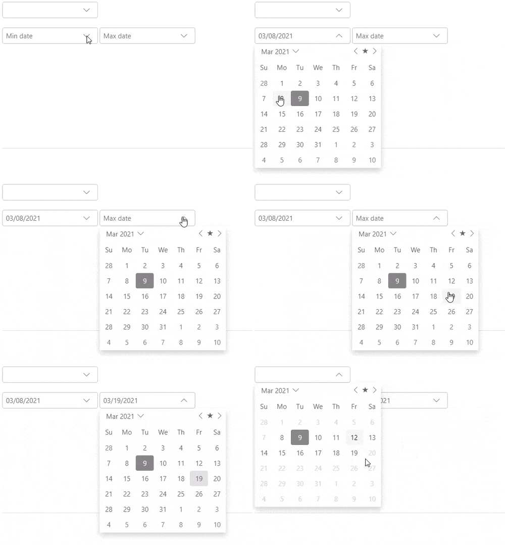
The following code uses the **MinDate** and **MaxDate** properties to display the date range for selection in the DateRangePicker control with the help of the DatePicker controls:
```razor
@code {
class C1DateRangePickerSettings
{
public DateTime? Min { get; set; }
public DateTime? Max { get; set; }
}
readonly C1DateRangePickerSettings _c1DateRangePickerSettings = new C1DateRangePickerSettings();
}
```
### Display Multiple Calendar Months
In addition to setting the date range, DateRangePicker allows you to display multiple calendar months at a time in the dropdown calendar. The DateRangePicker control supports multi-month view. It allows you to show multiple months in the calendar, at a time, using the [MonthCount](/componentone/api/blazor/online-blazor/dotnet-api/C1.Blazor.DateTimeEditors/C1.Blazor.DateTimeEditors.C1DateTimeBase-1.MonthCount.html) property. The value for the **MonthCount** property is set to 1, by default, for the DateRangePicker control. However, you can always change it based on your requirements.

The following code showcases the use of **MonthCount** property to display two months at a time in the calendar of the DateRangePicker control.
```razor
```