# DateRangePicker
Blazor Edition provides the DateTimePicker control with a single, intuitive UI for selecting date and time values. Learn about the DateTimePicker control in Blazor documentation.
## Content
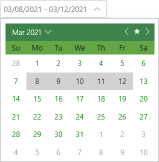
Incorporate **DateRangePicker for Blazor**, an advanced date picker, in your applications to provide users the ease of selecting a range of dates. The DateRangePicker control can be used in scenarios where you need to analyze data or run reports for a specific date window. It provides a simple and intuitive UI for selecting start and end date values. Moreover, it allows you to specify custom date ranges that users can pick from (like this week, last month, next year, etc.), or they can use the multi-month calendar in the drop-down to select date ranges with the mouse or keyboard.
## Key Features
* **Limit the Date Selection Range**
Restrict the users to select date range within specific span of days by setting maximum and minimum range option.
* **Display multi-month view**
Display multiple, adjacent months in a single calendar view and arrange the months horizontally or vertically with a single setting.
* **Predefine Custom Date Ranges**
The DateRangePicker control helps you define the date ranges (like last 30 days or last week) beforehand to set the date ranges frequently used by the users.
* **Customize Appearance**
DateRangePicker allows you to change its appearance and customize the style based on your application’s look and feel.