# Day and Date Customization
Customize the day and date in the DatePicker control. Learn more about the day and date customization in the DatePicker control in Blazor documentation.
## Content
In addition to changing date formats, DatePicker allows you to customize the dropdown calendar to show a limited set of days in the visible calendar month and display multiple calendar months at a time. Let us dive into the details of how to achieve these in the following sections.
## Set Date Range
DatePicker allows you to display a date range in the drop-down calendar and disable the rest of the dates from the calendar which implies that you can restrict the selection to the specified range of dates from the calendar. This can be done using the [MinDate](/componentone/api/blazor/online-blazor/dotnet-api/C1.Blazor.DateTimeEditors/C1.Blazor.DateTimeEditors.C1DatePicker.html#MINDATE) and [MaxDate](/componentone/api/blazor/online-blazor/dotnet-api/C1.Blazor.DateTimeEditors/C1.Blazor.DateTimeEditors.C1DatePicker.html#MAXDATE) properties of the [C1DatePicker](/componentone/api/blazor/online-blazor/dotnet-api/C1.Blazor.DateTimeEditors/C1.Blazor.DateTimeEditors.C1DatePicker.html) class which allow you to set the minimum number of days displayed before and maximum number of days displayed after the specified date for selection at runtime, respectively.
**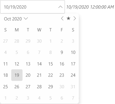**
The following code uses the **MinDate** and **MaxDate** properties to display the available date range for selection in the calendar:
```csharp
@_time
@code {
C1DatePicker _c1DatePicker;
DateTime _time = DateTime.Today;
}
```
## Display Multiple Calendar Months
The DatePicker control supports multi-month view. It allows you to show multiple months at a time in the drop-down calendar of the DatePicker control using [MonthCount](/componentone/api/blazor/online-blazor/dotnet-api/C1.Blazor.DateTimeEditors/C1.Blazor.DateTimeEditors.C1DatePicker.html#MONTHCOUNT) property of the **C1DatePicker** class.
**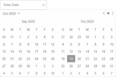**
The following code showcases the use of MonthCount property to display two months at a time in the DatePicker control.
```csharp
```