# Styling
Style the Calendar UI in different ways. Learn more about styling of the Calendar control in Blazor documentation.
## Content
Calendar offers different ways of styling the UI of the Calendar control. It allows you to use different styling properties available in the C1Calendar class which allows you to easily style all visual aspects of the control or use the CSS classes to style the control. Let us learn how we can style the Calendar control using both the ways in the following sections.
## Using Styling Properties
The **C1Calendar** class provides various styling properties which can be used to style the Calendar control in different ways. These properties are listed in the following table:
| **Properties** | **Description** |
| --- | --- |
| HeaderStyle | Changes the style for the header |
| DaysofWeekStyle | Changes the style for the day of week slots |
| TodayStyle | Changes the style for the today slot |
| DayStyle | Changes the style for the day slot |
| SelectedDateStyle | Changes the selected date style |
| AdjacentDayStyle | Changes the color used for the border between day slots |
| DisabledStyle | Changes the style for the disabled slots |
The following image showcases the Calendar control styled using the styling properties of the C1Calendar class:
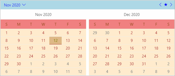
The following code demonstrates how you can style the Calendar control using the available styling properties in the C1Calendar class.
```razor
```
## Using CSS
The Calendar control can also be styled using the **.c1-calendar** CSS class. This CSS class can be used to style the complete Calendar control at once.
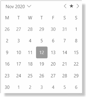
The following code showcases how you can use the .c1-calendar CSS class to style the C1Calendar control to give it a shadow effect.
```razor
```