# Chart Wizard
Use Chart Wizard to navigate smoothly through the process of creating a chart.
## Content
The Chart Wizard guides you through the process of creating a chart. When you drag and drop the Chart control onto the report design surface, the Chart Wizard is displayed.
> type=note
> **Note**: The Chart Wizard is displayed only if a report is bound to a data set. For the information on how to bind a chart to data, see our walkthrough [Create Clustered Column Chart](/activereportsnet/docs/v20.1/report-authors/report-controls/report-controls-page-rdl-report/chart-page-rdl/plots/column-bar-dvcharts/create-clustered-column-chart).
### Choose Chart Query and Plot
The first screen of the Chart Wizard asks you to select a chart query and a plot type.
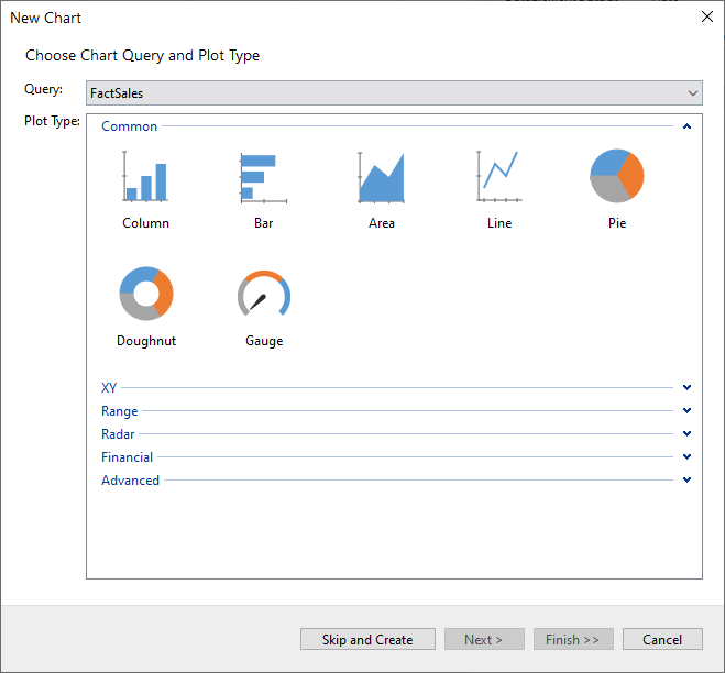
In the **Query** drop-down, select one of the report's available data queries. For information on setting up queries, see the [Configuring Data Queries](/activereportsnet/docs/v20.1/report-authors/using-report-wizard/configuring-data-queries) in Report Wizard.
In the **Plot Type** section, you will find the list of supported chart types organized into categories. These chart types are grouped to assist you in selecting the most appropriate visualization for your data. To learn more about the available chart types, refer to the chart tutorials under [Plots](/activereportsnet/docs/v20.1/report-authors/report-controls/report-controls-page-rdl-report/chart-page-rdl/plots) topic.
### Configure Chart Data Values
In the second screen of the Chart Wizard, configure the data values.
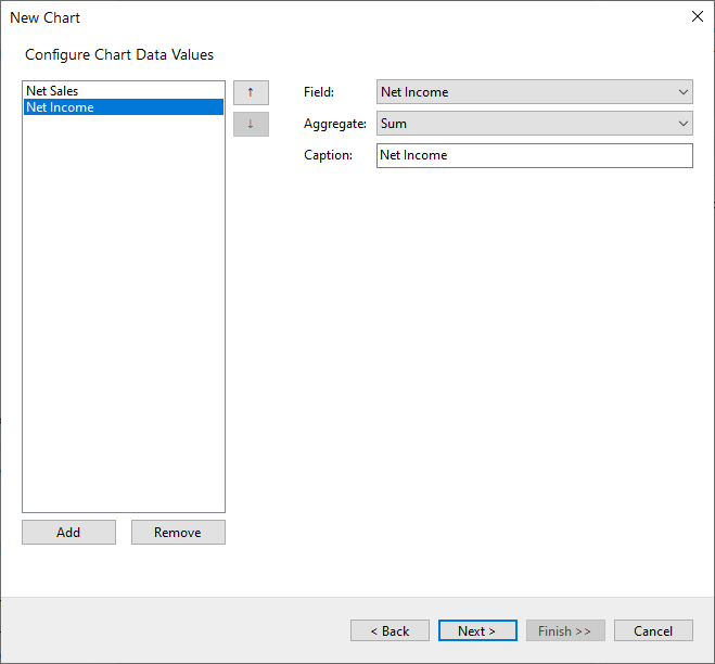
In this step, you can configure the data values that will be visualized as graphical shapes in your chart. Each data point represents a value or summary (e.g., a sum or average) that corresponds to a part of the data displayed in the chart.
### Field
This drop-down allows you to select the specific field from your data query that you want to visualize. If there is only one data value, then the axis title is set as the field's 'Caption'.
### Aggregate
Choose how the data should be aggregated. The wizard supports multiple aggregation functions to evaluate all the data value fields into a single value. Choose the aggregate function for the chart values from Average, Count, CountOfAll, CountDistinct, List, Min, Max, PopulationStandardDeviation, PopulationVariance, StandardDeviation, Sum, and Variance.
The selected function will be applied to the chosen field, summarizing the data based on the specified aggregate function and grouping that can be configured on the next steps.
### Caption
The caption provides a label for the data series in the chart. This label is especially useful when your chart displays multiple values, and you want to display a legend to distinguish between them.
For charts that only require a single value (like a pie or donut chart), one data field is sufficient. However, some chart types (such as range charts) may require multiple data values. For more details on handling multiple data values and advanced configurations, refer to the Using Chart article.
You can use the **Add** and **Remove** buttons to adjust the data fields shown in the chart. The up and down arrow buttons allow you to reorder the fields if your chart supports multiple values.
Click **Next** to proceed to the next step in the wizard.
### Configure Chart Data Groupings
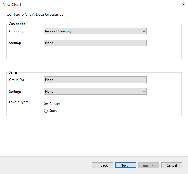
In the third screen of the Chart Wizard, configure the data groupings.
#### Categories
**Group By**
Specify the field to group the data into categories that exist for each unique value (or numerical range) for the specified field. The title of the axis is set to the corresponding category field name.
**Sorting**
Choose the data sorting direction from None, Ascending, or Descending.
#### Series
**Group By**
To group the data into series.
**Sorting**
Choose the data sorting direction from None, Ascending, or Descending. The sorting field is automatically set to the subcategory field.
**Layout Type**
Select the way you want the series groups to arrange from Cluster and Stack. The Layout type option is available for the supported chart types only, which are Column, Bar, Area, Spiral, Polar, and Range charts.
### Choose Report Colors
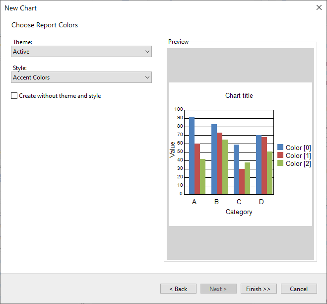
In the final step of the Chart Wizard, you can apply a color theme and style to your chart to make it visually appealing and ensure consistency in the design. The preview pane on the right allows you to see how your chart will look with the selected theme and style before finalizing the configuration.
### Theme
The **Theme** dropdown allows you to select from a variety of pre-defined themes that determine the base color palette for the chart. For instance, the screenshot shows the **Active** theme selected, which applies a specific set of colors to different chart elements, such as headers, footers, and data rows.
### Style
The **Style** dropdown provides additional customization within the selected theme by offering various styles to apply. These styles can subtly change how colors are used in the chart. In the screenshot, the **Light Style 1 Accent 1** is selected, which applies different shades of blue to the headers and footers, giving the chart a clean and professional appearance.
### Preview
On the right side, the **Preview** section shows how your selections will look when applied to the chart. The preview displays how different chart elements—like the header, group headers, group footers, details, and the chart footer—will be styled. Each group header and footer is visually distinct, using alternating colors to improve readability.
Once you’ve chosen the desired theme and style, click **Finish>>** to apply the settings and generate the chart in your report.
## See Also
[Create Clustered Column Chart](/activereportsnet/docs/v20.1/report-authors/report-controls/report-controls-page-rdl-report/chart-page-rdl/plots/column-bar-dvcharts/create-clustered-column-chart)
[Plots](/activereportsnet/docs/v20.1/report-authors/report-controls/report-controls-page-rdl-report/chart-page-rdl/plots)