# Custom Properties in Chart
Learn about the custom properties in Section report's charts.
## Content
The topic explains how to set the custom properties in Section Reports charts. Each chart type in the ActiveReports Chart control contains specific properties that apply to it. You can set the chart type and the correlating series-specific properties in the Series Collection Editor dialog via the Series (Collection) property in the Properties Panel of Visual Studio and in the DataPoint Collection dialog box via the Points (Collection) property in the Series dialog.
**Note** that 2D Area Charts do not have any custom properties.
### 3D Area Chart
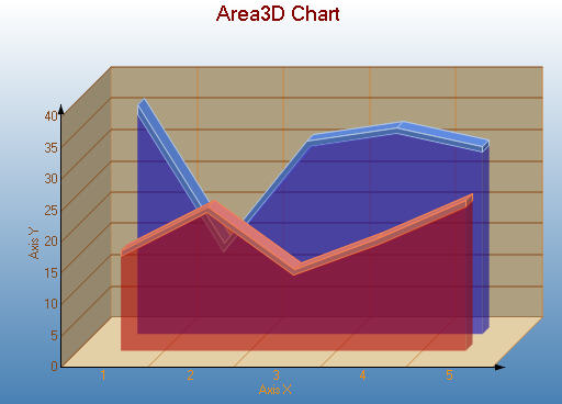
**Custom Properties**
The **LineBackdrop** property gets or sets the backdrop information for the 3D line.
The **Thickness** property gets or sets the thickness of the 3D line.
The **Width** property gets or sets the width of the 3D line.
Below is an example of how to set the custom chart properties at run time for a 3D area chart as shown for the first series in the image above.
```vbnet
Me.ChartControl1.Series(0).Properties("LineBackdrop") = New GrapeCity.ActiveReports.Chart.Graphics.Backdrop(Color.Red, CType(150, Byte))
Me.ChartControl1.Series(0).Properties("Thickness") = 5.0F
Me.ChartControl1.Series(0).Properties("Width") = 30.0F
```
```csharp
this.ChartControl1.Series[0].Properties["LineBackdrop"] = new GrapeCity.ActiveReports.Chart.Graphics.Backdrop(System.Drawing.Color.Red, ((System.Byte)(150)));
this.ChartControl1.Series[0].Properties["Thickness"] = 5f;
this.ChartControl1.Series[0].Properties["Width"] = 30f;
```
Similarly, the for **Stacked Area Chart** and **Stacked Area 100% Chart,** the **Width** property is the custom property that gets or sets the width of the 3D stacked area.
### 2D Bar Charts
**Simple Bar Chart**
The **Gap** property gets or sets the space between the bars of each X axis value.
Below is an example of how to set the custom chart properties at run time for a bar chart.
```vbnet
Me.ChartControl1.Series(0).Properties("Gap") = 50.0F
```
```csharp
this.ChartControl1.Series[0].Properties["Gap"] = 50f;
```
**Gantt Chart**
The **Gap** property gets or sets the space between the bars of each X axis value.
Below is an example of how to set the custom chart properties at run time for a Gantt chart.
```vbnet
Me.ChartControl1.Series(0).Properties("Gap") = 50.0F
```
```csharp
this.ChartControl1.Series[0].Properties["Gap"] = 50f;
```
**Horizontal Bar Chart**
The **Gap** property gets or sets the space between the bars of each X axis value.
Below is an example of how to set the custom chart properties at run time for a horizontal bar chart.
```vbnet
Me.ChartControl1.Series(0).Properties("Gap") = 65.0F
```
```csharp
this.ChartControl1.Series[0].Properties["Gap"] = 65f;
```
**Stacked Bar Chart**
The **Gap** property gets or sets the space between the bars of each X axis value.
Below is an example of how to set the custom chart properties at run time for a StackedBar chart.
```vbnet
Me.ChartControl1.Series(0).Properties("Gap") = 100.0F
```
```csharp
this.ChartControl1.Series[0].Properties["Gap"] = 100f;
```
**Stacked Bar Chart 100%**
The **Gap** property gets or sets the space between the bars of each X axis value.
Below is an example of how to set the custom chart properties at run time for a StackedBAR110Pct chart.
```vbnet
Me.ChartControl1.Series(0).Properties("Gap") = 100.0F
```
```csharp
this.ChartControl1.Series[0].Properties["Gap"] = 100f;
```
### 3D Bar Chart
**Simple Bar Chart**
The **BarTopPercent** property gets or sets the percentage of the top of the bar that is shown for Cone or Custom BarTypes.
The **BarType** property gets or sets the type of bars that is displayed.Use BarType enumeration value.
The **Gap** property gets or sets the space between the bars of each X axis value.
The **RotationAngle** propertygets or sets the starting horizontal angle for custom 3D bar shapes. Can only be used with the Custom BarType.
The **VertexNumber** property gets or sets the number of vertices for the data point, used to create custom 3D bar shapes. Can only be used with the Custom BarType. Bars must contain 3 or more vertices.
**Gantt Chart**
The **BarTopPercent** property gets or sets the percentage of the top of the bar that is shown for Cone or Custom BarTypes.
The **BarType** property gets or sets the type of bars that are displayed. Use BarType enumeration value.
The **Gap** property gets or sets the space between the bars of each X axis value.
The **VertexNumber** property gets or sets the number of vertices for the data point, used to create custom 3D bar shapes. Can only be used with the Custom BarType. Bars must contain 3 or more vertices.
**Horizontal Bar Chart**
The **BarTopPercent** property gets or sets the percentage of the top of the bar that is shown for Cone or Custom BarTypes.
The **BarType** propertygets or sets the type of bars that is displayed. Use BarType enumeration value.
The **Gap** property gets or sets the space between the bars of each X axis value.
The **RotationAngle** property gets or sets the starting horizontal angle for custom 3D bar shapes. Can only be used with the Custom BarType.
The **VertexNumber** property gets or sets the number of vertices for the data point, used to create custom 3D bar shapes. Can only be used with the Custom BarType. Bars must contain 3 or more vertices.
Below is an example of how to set the custom chart properties at run time for a horizontal 3D bar chart as shown above.
```vbnet
Me.ChartControl1.Series(0).Properties("BarTopPercent") = 80.0F
Me.ChartControl1.Series(0).Properties("BarType") = GrapeCity.ActiveReports.Chart.BarType.Custom
Me.ChartControl1.Series(0).Properties("Gap") = 65.0F
Me.ChartControl1.Series(0).Properties("PointBarDepth") = 100.0F
Me.ChartControl1.Series(0).Properties("RotationAngle") = 0.0F
Me.ChartControl1.Series(0).Properties("VertexNumber") = 6
```
```csharp
this.ChartControl1.Series[0].Properties["BarTopPercent"] = 80f;
this.ChartControl1.Series[0].Properties["BarType"] = GrapeCity.ActiveReports.Chart.BarType.Custom;
this.ChartControl1.Series[0].Properties["Gap"] = 65f;
this.ChartControl1.Series[0].Properties["PointBarDepth"] = 100.0f;
this.ChartControl1.Series[0].Properties["RotationAngle"] = 0f;
this.ChartControl1.Series[0].Properties["VertexNumber"] = 6;
```
**Stacked Bar Chart**
The **BarTopPercent** property gets or sets the percentage of the top of the bar that is shown for Cone or Custom BarTypes.
The **BarType** property gets or sets the type of bars that are displayed. Use BarType enumeration value.
The **Gap** property gets or sets the space between the bars of each X axis value.
The **VertexNumber** property gets or sets the number of vertices for the data point, used to create custom 3D bar shapes. Can only be used with the Custom BarType. Bars must contain 3 or more vertices.
Below is an example of how to set the custom chart properties at run time for a StackedBar3D chart.
```vbnet
Me.ChartControl1.Series(0).Properties("BarTopPercent") = 80.0F
Me.ChartControl1.Series(0).Properties("BarType") = GrapeCity.ActiveReports.Chart.BarType.Custom
Me.ChartControl1.Series(0).Properties("Gap") = 65.0F
Me.ChartControl1.Series(0).Properties("VertexNumber") = 6
```
```csharp
this.ChartControl1.Series[0].Properties["BarTopPercent"] = 100f;
this.ChartControl1.Series[0].Properties["BarType"] = GrapeCity.ActiveReports.Chart.BarType.Custom;
this.ChartControl1.Series[0].Properties["Gap"] = 65f;
this.ChartControl1.Series[0].Properties["VertexNumber"] = 6
```
**Bar/Cylinder Chart**
The **BarTopPercent** property gets or sets the percentage of the top of the bar that is shown for Cone or Custom BarTypes.
The **BarType** property gets or sets the type of bars that is displayed. Use BarType enumeration value.
The **Gap** property gets or sets the space between the bars of each X axis value.
The **RotationAngle** property gets or sets the starting horizontal angle for custom 3D bar shapes. Can only be used with the Custom BarType.
The **VertexNumber** property gets or sets the number of vertices for the data point, used to create custom 3D bar shapes. Can only be used with the Custom BarType. Bars must contain 3 or more vertices.
**Bar/Pyramid Chart**
The **BarTopPercent** property gets or sets the percentage of the top of the bar that is shown for Cone or Custom BarTypes.
The **BarType** property gets or sets the type of bars that is displayed. Use BarType enumeration value.
The **Gap** property gets or sets the space between the bars of each X axis value.
The **RotationAngle** property gets or sets the starting horizontal angle for custom 3D bar shapes. Can only be used with the Custom BarType.
The **VertexNumber** property gets or sets the number of vertices for the data point, used to create custom 3D bar shapes. Can only be used with the Custom BarType. Bars must contain 3 or more vertices.
**Clustered Bar Chart**
The **BarTopPercent** property gets or sets the percentage of the top of the bar that is shown for Cone or Custom BarTypes.
The **BarType** property gets or sets the type of bars that are displayed. Use BarType enumeration value.
The **Gap** property gets or sets the space between the bars of each X axis value.
The **RotationAngle** property gets or sets the starting horizontal angle for custom 3D bar shapes. Can only be used with the Custom BarType.
The **VertexNumber** property gets or sets the number of vertices for the data point, used to create custom 3D bar shapes. Can only be used with the Custom BarType. Bars must contain 3 or more vertices.
Below is an example of how to set the custom chart properties at run time for a 3D clustered bar chart as shown above.
```vbnet
' set the custom properties for series 1.
Me.ChartControl1.Series(0).Properties("BarTopPercent") = 50.0F
Me.ChartControl1.Series(0).Properties("BarType") = GrapeCity.ActiveReports.Chart.BarType.Custom
Me.ChartControl1.Series(0).Properties("Gap") = 300.0F
Me.ChartControl1.Series(0).Properties("RotationAngle") = 0.0F
Me.ChartControl1.Series(0).Properties("VertexNumber") = 6
' set the custom properties for series 2.
Me.ChartControl1.Series(1).Properties("BarTopPercent") = 20.0F
Me.ChartControl1.Series(1).Properties("BarType") = GrapeCity.ActiveReports.Chart.BarType.Custom
Me.ChartControl1.Series(1).Properties("Gap") = 300.0F
Me.ChartControl1.Series(1).Properties("RotationAngle") = 90.0F
Me.ChartControl1.Series(1).Properties("VertexNumber") = 3
```
```csharp
// set the custom properties for series 1.
this.ChartControl1.Series[0].Properties["BarTopPercent"] = 50f;
this.ChartControl1.Series[0].Properties["BarType"] = GrapeCity.ActiveReports.Chart.BarType.Custom;
this.ChartControl1.Series[0].Properties["RotationAngle"] = 0f;
this.ChartControl1.Series[0].Properties["VertexNumber"] = 6;
// set the custom properties for series 2.
this.ChartControl1.Series[1].Properties["BarTopPercent"] = 20f;
this.ChartControl1.Series[1].Properties["BarType"] = GrapeCity.ActiveReports.Chart.BarType.Custom;
this.ChartControl1.Series[1].Properties["Gap"] = 300f;
this.ChartControl1.Series[1].Properties["RotationAngle"] = 90f;
this.ChartControl1.Series[1].Properties["VertexNumber"] = 3;
```
### 2D Line Chart
**Bezier Chart**
Custom properties are as follows:
The **Line** property gets or sets the line element. Used to set color, thickness and shape of a line.
The **Tension** property gets or sets the tension of the curved lines.
**Bezier XY**
Custom properties are as follows:
The **Line** property gets or sets the line element. Used to set color, thickness and shape of a line.
The **Tension** property gets or sets the tension of the curved lines.
**Simple 2D Line Chart and Line XY Chart**
Custom properties are as follows:
The **Line** property gets or sets the line element. Used to set color, thickness and shape of a line.
The **LineJoin** property sets the type of join to draw when two lines connect.
### Pie and Doughnut Charts
**Doughnut**
The **Clockwise** property gets or sets a value indicating whether to display the data in clockwise order.
The **ExplodeFactor** property gets or sets the amount of separation between data point values.
The **HoleSize** property gets or sets the inner radius of the chart.
The **OutsideLabels** property gets or sets a value indicating whether the data point labels appear outside the chart.
The **StartAngle** property gets or sets the horizontal start angle for the series.
Below is an example of how to set custom chart properties at run time for a doughnut chart.
```vbnet
Me.ChartControl1.Series(0).Properties("ExplodeFactor") = 0.0F
Me.ChartControl1.Series(0).Properties("HoleSize") = 0.25F
Me.ChartControl1.Series(0).Properties("OutsideLabels") = False
Me.ChartControl1.Series(0).Properties("Radius") = 2.0F
Me.ChartControl1.Series(0).Properties("StartAngle") = 0.0F
```
```csharp
this.ChartControl1.Series[0].Properties["ExplodeFactor"] = 0f;
this.ChartControl1.Series[0].Properties["HoleSize"] = 0.25f;
this.ChartControl1.Series[0].Properties["OutsideLabels"] = false;
this.ChartControl1.Series[0].Properties["Radius"] = 2.0f;
this.ChartControl1.Series[0].Properties["StartAngle"] = 0f;
```
**Funnel**
The **CalloutLine** property gets or sets the style for a line connecting the marker label to its corresponding funnel section. The default value is a black one-point line.
The **FunnelStyle** property gets or sets the Y value for the series points to the width or height of the funnel. The default value is YIsHeight.
The **MinPointHeight** property gets or sets the minimum height allowed for a data point in the funnel chart. The height is measured in relative coordinates.
The **NeckHeight** property gets or sets the neck height for the funnel chart. This property can only be used with the FunnelStyle property set to YIsHeight. The default value is 5.
The **NeckWidth** property gets or sets the neck width for the funnel chart. This property can only be used with the FunnelStyle property set to YIsHeight. The default value is 5.
The **OutsideLabels** property gets or sets a value indicating whether the labels are placed outside of the funnel chart. The default value is True.
The **OutsideLabelsPlacement** property gets or sets a value indicating whether the data point labels appear on the left or right side of the funnel. This property can only be used with the OutsideLabels property set to True.
The **PointGapPct** property gets or sets the amount of space between the data points of the funnel chart. The PointGapPct is measured in relative coordinates. The default value is 0, and valid values range from 0 to 100.
```csharp
using GrapeCity.ActiveReports.Chart;
using GrapeCity.ActiveReports.Chart.Graphics;
```
```csharp
this.ChartControl1.Series[0].Properties["BaseStyle"] = BaseStyle.SquareBase;
this.ChartControl1.Series[0].Properties["CalloutLine"] = new Line(Color.Black, 2, LineStyle.Dot);
this.ChartControl1.Series[0].Properties["FunnelStyle"] = FunnelStyle.YIsWidth;
this.ChartControl1.Series[0].Properties["MinPointHeight"] = 10f;
this.ChartControl1.Series[0].Properties["NeckWidth"] = 20f;
this.ChartControl1.Series[0].Properties["NeckHeight"] = 5f;
this.ChartControl1.Series[0].Properties["OutsideLabels"] = true;
this.ChartControl1.Series[0].Properties["OutsideLabelsPlacement"] = LabelsPlacement.Right;
this.ChartControl1.Series[0].Properties["PointGapPct"] = 3f;
this.ChartControl1.Series[0].Properties["RotationAngle"] = 3f;
```
**Pyramid**
The **CalloutLine** property gets or sets the style for a line connecting the marker label to its corresponding pyramid section. The default value is a black one-point line.
The **MinPointHeight** property gets or sets the minimum height allowed for a data point in the pyramid chart. The height is measured in relative coordinates.
The **OutsideLabels** property gets or sets a value indicating whether the labels are placed outside of the pyramid chart. The default value is True.
The **OutsideLabelsPlacement** property gets or sets a value indicating whether the data point labels appear on the left or right side of the pyramid. This property can only be used with the OutsideLabels property set to True.
The **PointGapPct** property gets or sets the amount of space between the data points of the pyramid chart. The PointGapPct is measured in relative coordinates. The default value is 0, and valid values range from 0 to 100.
### 3D Pie and Doughnut charts
**Doughnut Chart**
The **Clockwise** property gets or sets a value indicating whether to display the data in clockwise order.
The **ExplodeFactor** property gets or sets the amount of separation between data point values. The value must be less than or equal to 1. To explode one section of the doughnut chart, set ExplodeFactor to the data point instead of the series.
The **HoleSize** property gets or sets the inner radius of the chart. If set to 0, the chart looks like a pie chart. The value must be less than or equal to 1.
The **OutsideLabels** property gets or sets a value indicating whether the data point labels appear outside the chart.
The **Radius** property gets or sets the size of the doughnut within the chart area.
The **StartAngle** property gets or sets the horizontal start angle for the series data points.
Below is an example of how to set the custom chart properties at run time for a 3D doughnut chart as shown in the image above.
```vbnet
Me.ChartControl1.Series(0).Properties("ExplodeFactor") = 0.0F
Me.ChartControl1.Series(0).Properties("HoleSize") = 0.33F
Me.ChartControl1.Series(0).Properties("OutsideLabels") = False
Me.ChartControl1.Series(0).Properties("Radius") = 2.0F
Me.ChartControl1.Series(0).Properties("StartAngle") = 50.0F
```
```csharp
this.chartControl1.Series[0].Properties["ExplodeFactor"] = 0f;this.chartControl1.Series[0].Properties["HoleSize"] = .33f;this.chartControl1.Series[0].Properties["OutsideLabels"] = false;this.chartControl1.Series[0].Properties["StartAngle"] = 50f;
```
**Funnel Chart**
The **BaseStyle** property gets or sets a circular or square base drawing style for the 3D funnel chart.
The **CalloutLine** property gets or sets the style for a line connecting the marker label to its corresponding funnel section. The default value is a black one-point line.
The **FunnelStyle** property gets or sets the Y value for the series points to the width or height of the funnel. The default value is YIsHeight.
The **MinPointHeight** property gets or sets the minimum height allowed for a data point in the funnel chart. The height is measured in relative coordinates.
The **NeckHeight** property gets or sets the neck height for the funnel chart. This property can only be used with the FunnelStyle property set to YIsHeight. The default value is 5.
The **NeckWidth** property gets or sets the neck width for the funnel chart. This property can only be used with the FunnelStyle property set to YIsHeight. The default value is 5.
The **OutsideLabels** property gets or sets a value indicating whether the labels are placed outside of the funnel chart. The default value is True.
The **OutsideLabelsPlacement** property gets or sets a value indicating whether the data point labels appear on the left or right side of the funnel. This property can only be used with the OutsideLabels property set to True.
The **PointGapPct** property gets or sets the amount of space between the data points of the funnel chart. The PointGapPct is measured in relative coordinates. The default value is 0, and valid values range from 0 to 100.
The **RotationAngle** property gets or sets the left-to-right rotation angle of the funnel. The valid values range from -180 to 180 degrees. This property is only effective with the Projection property set to Orthogonal and the BaseStyle property set to SquareBase.
Below is an example of how to set the custom chart properties at run time for a 3D funnel chart.
```vbnet
Imports GrapeCity.ActiveReports.Chart
Imports GrapeCity.ActiveReports.Chart.Graphics
```
```vbnet
With Me.ChartControl1.Series(0)
.Properties("BaseStyle") = BaseStyle.SquareBase
.Properties("CalloutLine") = New Line(Color.Black, 2, LineStyle.Dot)
.Properties("FunnelStyle") = FunnelStyle.YIsWidth
.Properties("MinPointHeight") = 10.0F
.Properties("NeckWidth") = 20.0F
.Properties("NeckHeight") = 5.0F
.Properties("OutsideLabels") = True
.Properties("OutsideLabelsPlacement") = LabelsPlacement.Right
.Properties("PointGapPct") = 3.0F
.Properties("RotationAngle") = 3.0F
End With
```
```csharp
using GrapeCity.ActiveReports.Chart;
using GrapeCity.ActiveReports.Chart.Graphics;
```
```csharp
this.ChartControl1.Series[0].Properties["BaseStyle"] = BaseStyle.SquareBase;
this.ChartControl1.Series[0].Properties["CalloutLine"] = new Line(Color.Black, 2, LineStyle.Dot);
this.ChartControl1.Series[0].Properties["FunnelStyle"] = FunnelStyle.YIsWidth;
this.ChartControl1.Series[0].Properties["MinPointHeight"] = 10f;
this.ChartControl1.Series[0].Properties["NeckWidth"] = 20f;
this.ChartControl1.Series[0].Properties["NeckHeight"] = 5f;
this.ChartControl1.Series[0].Properties["OutsideLabels"] = true;
this.ChartControl1.Series[0].Properties["OutsideLabelsPlacement"] = LabelsPlacement.Right;
this.ChartControl1.Series[0].Properties["PointGapPct"] = 3f;
this.ChartControl1.Series[0].Properties["RotationAngle"] = 3f;
```
**Pyramid Chart**
The **BaseStyle** property gets or sets a circular or square base drawing style for the 3D pyramid chart.
The **CalloutLine** property gets or sets the style for a line connecting the marker label to its corresponding pyramid section. The default value is a black one-point line.
The **MinPointHeight** property gets or sets the minimum height allowed for a data point in the pyramid chart. The height is measured in relative coordinates.
The **OutsideLabels** property gets or sets a value indicating whether the labels are placed outside of the pyramid chart. The default value is True.
The **OutsideLabelsPlacement** property gets or sets a value indicating whether the data point labels appear on the left or right side of the pyramid. This property can only be used with the OutsideLabels property set to True.
The **PointGapPct** property gets or sets the amount of space between the data points of the pyramid chart. The PointGapPct is measured in relative coordinates. The default value is 0, and valid values range from 0 to 100.
The **RotationAngle** property gets or sets the left-to-right rotation angle of the pyramid. The valid values range from -180 to 180 degrees. This property is only effective with the Projection property set to Orthogonal and the BaseStyle property set to SquareBase.
Below is an example of how to set the custom chart properties at run time for a Pyramid chart.
```vbnet
Imports GrapeCity.ActiveReports.Chart
Imports GrapeCity.ActiveReports.Chart.Graphics
```
```vbnet
With Me.ChartControl1.Series(0)
.Properties("BaseStyle") = BaseStyle.SquareBase
.Properties("MinPointHeight") = 10.0F
.Properties("OutsideLabels") = True .Properties("OutsideLabelsPlacement") = LabelsPlacement.Right .Properties("PointGapPct") = 3.0F
.Properties("RotationAngle") = 3.0F End With
```
```csharp
using GrapeCity.ActiveReports.Chart;
using GrapeCity.ActiveReports.Chart.Graphics;
```
```csharp
this.ChartControl1.Series[0].Properties["BaseStyle"] = BaseStyle.SquareBase;
this.ChartControl1.Series[0].Properties["MinPointHeight"] = 10f;
this.ChartControl1.Series[0].Properties["OutsideLabels"] = true;
this.ChartControl1.Series[0].Properties["OutsideLabelsPlacement"] = LabelsPlacement.Right;
this.ChartControl1.Series[0].Properties["PointGapPct"] = 3f;
this.ChartControl1.Series[0].Properties["RotationAngle"] = 3f;
```
### Candle Stick Chart
The **BodyDownswingBackdrop** property gets or sets the backdrop information used to fill the rectangle for data points in which the closing figure is lower than the opening figure.
The **BodyUpswingBackdrop** property gets or sets the backdrop information used to fill the rectangle for data points in which the closing figure is higher than the opening figure.
The **BodyWidth** property gets or sets the width of the rectangle used to show upswing or downswing.
The **WickLine** property gets or sets the line information for the wick line.
Below is an example of how to set the custom chart properties at run time for a Pyramid chart.
```vbnet
Imports GrapeCity.ActiveReports.Chart.Graphics
```
```vbnet
With Me.ChartControl1.Series(0)
.Properties("BodyDownswingBackdrop") = New Chart.Graphics.Backdrop(Color.FromArgb(255, 192, 255))
.Properties("BodyUpswingBackdrop") = New Chart.Graphics.Backdrop(Color.FromArgb(192, 192, 255))
.Properties("WickLine") = New Chart.Graphics.Line(Color.Indigo)
.Properties("BodyWidth") = 7.0F
End With
```
```csharp
using GrapeCity.ActiveReports.Chart.Graphics;
```
```csharp
this.ChartControl1.Series[0].Properties["BodyDownswingBackdrop"]= new Chart.Graphics.Backdrop
(Color.FromArgb(255, 192, 255));
this.ChartControl1.Series[0].Properties["BodyUpswingBackdrop"] = new Chart.Graphics.Backdrop
(Color.FromArgb(192, 192, 255));
this.ChartControl1.Series(0).Properties("WickLine") = new Chart.Graphics.Line(Color.Indigo);
this.ChartControl1.Series[0].Properties["BodyWidth"] = 7f;
```
### HiLo Chart
The HiloLine property gets or sets the line information for the HiLo line.
Below is an example of how to set the custom chart properties at run time for a HiLo chart as shown in the image above.
```vbnet
Me.ChartControl1.Series(0).Properties("HiloLine") = New GrapeCity.ActiveReports.Chart.Graphics.Line(Color.DeepSkyBlue, 4)
```
```csharp
this.ChartControl1.Series[0].Properties["HiloLine"] = new GrapeCity.ActiveReports.Chart.Graphics.Line(Color.DeepSkyBlue, 4);
```
### Point and Figure Chart
The **BoxSize** property gets or sets the amount a price must change in order to create another X or O.
The **DownswingLine** property gets or sets the style and color settings for the downswing O's.
The **ReversalAmount** property gets or sets the amount that a price must shift in order for a new column to be added.
The **UpswingLine** property gets or sets the style and color settings for the upswing X's.
Below is an example of how to set the custom chart properties at run time for a Point and Figure chart.
```vbnet
Imports GrapeCity.ActiveReports.Chart.Graphics
```
```vbnet
With Me.ChartControl1.Series(0)
.Properties("DownswingLine") = New Chart.Graphics.Line(Color.Red)
.Properties("UpswingLine") = New Chart.Graphics.Line(Color.Blue)
.Properties("BoxSize") = 3.0F
End With
```
```csharp
using GrapeCity.ActiveReports.Chart.Graphics;
```
```csharp
this.ChartControl1.Series[0].Properties["DownswingLine"] = new Chart.Graphics.Line(Color.Red);
this.ChartControl1.Series[0].Properties["UpswingLine"] = new Chart.Graphics.Line(Color.Blue);
this.ChartControl1.Series[0].Properties["BoxSize"] = 3f;
```
### Renko Chart
The **BodyDownswingBackdrop** property gets or sets the style and color settings for the downswing bricks.
The **BodyUpswingBackdrop** property gets or sets the style and color settings for the upswing bricks.
The **BoxSize** property gets or sets the amount a price must change in order to create another brick.
Below is an example of how to set the custom chart properties at run time for a Renko chart.
```vbnet
Imports GrapeCity.ActiveReports.Chart.Graphics
```
```vbnet
With Me.ChartControl1.Series(0)
.Properties("BodyDownswingBackdrop") = New Backdrop(Color.BlueViolet)
.Properties("BodyUpswingBackdrop") = New Backdrop(Color.Navy)
.Properties("BoxSize") = 3.0F
End With
```
```csharp
using GrapeCity.ActiveReports.Chart.Graphics;
```
```csharp
this.ChartControl1.Series[0].Properties["BodyDownswingBackdrop"] = new Backdrop(Color.BlueViolet);
this.ChartControl1.Series[0].Properties["BodyUpswingBackdrop"] = new Backdrop(Color.Navy);
this.ChartControl1.Series[0].Properties["BoxSize"] = 3f;
```
### Kagi Chart
The **DownswingLine** property gets or sets the style and color settings to use for a Kagi line which charts a price decrease.
The **ReversalAmount** property gets or sets the amount that a price must shift in order for the Kagi line to change direction.
The **UpswingLine** property gets or sets the style and color settings to use for a Kagi line which charts a price increase.
Below is an example of how to set the custom chart properties at run time for a Kagi chart.
```vbnet
Imports GrapeCity.ActiveReports.Chart.Graphics
```
```vbnet
With Me.ChartControl1.Series(0)
.Properties("BodyDownswingBackdrop") = New Backdrop(Color.Red)
.Properties("BodyUpswingBackdrop") = New Backdrop(Color.Blue)
.Properties("DownswingLine") = New Chart.Graphics.Line(Color.DarkRed)
.Properties("ReversalAmount") = "25"
.Properties("UpswingLine") = New Chart.Graphics.Line(Color.DarkBlue)
.Properties("Width") = 50.0F
End With
```
```csharp
using GrapeCity.ActiveReports.Chart.Graphics;
```
```csharp
this.ChartControl1.Series[0].Properties["BodyDownswingBackdrop"] = new Backdrop(Color.Red);
this.ChartControl1.Series[0].Properties["BodyUpswingBackdrop"] = new Backdrop(Color.Blue);
this.ChartControl1.Series[0].Properties["DownswingLine"] = new Chart.Graphics.Line(Color.DarkRed);
this.ChartControl1.Series[0].Properties["ReversalAmount"] = "25";
this.ChartControl1.Series[0].Properties["UpswingLine"] = new Chart.Graphics.Line(Color.DarkBlue);
this.ChartControl1.Series[0].Properties["Width"] = 50f;
```
### Stock Chart
The **CloseLine** property gets or sets the information for the close value line.
The **HiLoLine** property gets or sets the line information for the HiLo line.
The **OpenLine** property property gets or sets the information for the open value line.
The **TickLen** property property gets or sets the tick length for the close value and open value lines.
### Stock Close Only Chart
The **CloseLine** property gets or sets the information for the close value line.
The **HiLoLine** property gets or sets the line information for the HiLo line.
The **OpenLine** property property gets or sets the information for the open value line.
The **TickLen** property property gets or sets the tick length for the close value and open value lines.
### Stock Open Only Chart
The **CloseLine** property gets or sets the information for the close value line.
The **HiLoLine** property gets or sets the line information for the HiLo line.
The **OpenLine** property property gets or sets the information for the open value line.
The **TickLen** property property gets or sets the tick length for the close value and open value lines.
### Three Line Break Chart
The **BodyDownswingBackdrop** property gets or sets the style and color settings for the downswing boxes.
The **BodyUpswingBackdrop** property gets or sets the style and color settings for the upswing boxes.
The **NewLineBreak** property gets or sets the number of previous boxes/lines that must be compared before a new box/line is drawn. The default value is 3.
Below is an example of how to set the custom chart properties at run time for a Three Line Break chart.
```vbnet
Imports GrapeCity.ActiveReports.Chart.Graphics
```
```vbnet
With Me.ChartControl1.Series(0)
.Properties("BodyDownswingBackdrop") = New Backdrop(Color.Red)
.Properties("BodyUpswingBackdrop") = New Backdrop(Color.Black)
.Properties("NewLineBreak") = 3
End With
```
```csharp
using GrapeCity.ActiveReports.Chart.Graphics;
```
```csharp
this.ChartControl1.Series[0].Properties["BodyDownswingBackdrop"] = new Backdrop(Color.Red);
this.ChartControl1.Series[0].Properties["BodyUpswingBackdrop"] = new Backdrop(Color.Black);
this.ChartControl1.Series[0].Properties["NewLineBreak"] = 3;
```
## See Also
#### Report Authors
[Chart](/activereportsnet/docs/v19.2/report-authors/report-controls/report-controls-section-report/chart-section)