# Report Designer Theming
Learn about theming for the ActiveReportsJS Report Designer Component
## Content
## Introduction
ActiveReportsJS provides flexible theming options for the `Report Designer` component, allowing seamless customization to match your application's design. The theming capabilities include:
* **Built-in Color Themes** – Predefined themes that adjust the designer's appearance.
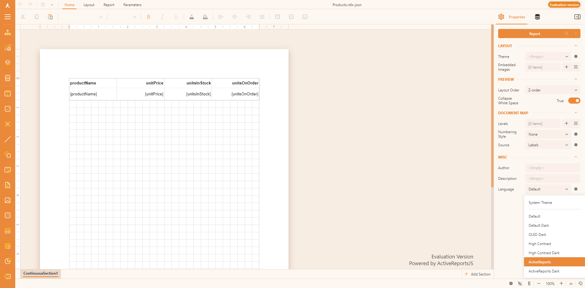
* **Theme Selector** – A built-in control in the viewer toolbar that allows users to switch between available themes.
* **API for Customization** – A set of APIs to create custom themes, programmatically set the designer theme, and configure the theme selector.
These features enable a consistent and personalized user experience while integrating the Report Designer into different UI styles.
## Initial Setup
To enable theming in the Report Designer, you need to include the required stylesheets in your application. The following CSS files are available through the ActiveReportsJS [download package](https://developer.mescius.com/activereportsjs/download), [CDN distribution](/activereportsjs/docs/v6.1/GettingStarted/Installation#report-viewer-ui-themes), and the [@mescius/activereportsjs](https://www.npmjs.com/package/@mescius/activereportsjs) npm package:
* **`ar-js-ui.css`** – Common styles shared between the `Report Viewer` and `Report Designer` components.
* **`ar-js-designer.css`** – Designer-specific styles, including multiple predefined themes:
* `System` – Adapts to the user’s system theme settings (light or dark mode) automatically.
* `Default` – A clean and modern light theme designed for standard readability and usability.
* `DefaultDark` – A dark version of the Default theme, reducing eye strain in low-light environments.
* `DarkOled` – A deep black OLED-friendly theme designed to maximize contrast and save power on OLED displays.
* `HighContrast` – A light high-contrast theme for improved visibility and accessibility.
* `HighContrastDark` – A dark high-contrast theme for users who require high readability in dark mode.
* `ActiveReports` – A classic ActiveReports-inspired theme with a familiar UI style.
* `ActiveReportsDark` – A dark version of the ActiveReports theme for a more subdued, eye-friendly interface.
For applications using a CDN, add the following `` tags to include the styles:
```html
```
If your application supports module-based CSS imports, you can include the styles directly in your code:
```js
import "@mescius/activereportsjs/styles/ar-js-ui.css";
import "@mescius/activereportsjs/styles/ar-js-designer.css";
```
## Using themeConfig API
The `themeConfig` property of the Report Designer configuration allows you to:
* Set the **initial theme**.
* Enable or disable the **theme selector**.
* Define which **themes are available** in the theme selector. For Pure JavaScript applications, use the `themeConfig` property in the second argument of the `MESCIUS.ActiveReportsJS.ReportDesigner.Designer` constructor:
```js
var designer = new MESCIUS.ActiveReportsJS.ReportDesigner.Designer("#designer-host", {
themeConfig: {
// Set the initial theme
initialTheme: 'ActiveReports',
themeSelector: {
// Enable or disable the theme selector
isEnabled: true,
// Define available themes in the selector
availableThemes: [`ActiveReports`, `ActiveReportsDark`]
}
}
});
```
For React, Angular, Vue, and Svelte, you can use the `onInit` property that should resolve to a function that retrieves the `DesignerConfig` object, for example:
Example: Using `themeConfig` in React.
```jsx
import React from "react";
import { Designer} from "@mescius/activereportsjs-react";
function onInit() {
return {
themeConfig: {
initialTheme : 'ActiveReports',
themeSelector: {
isEnabled: true,
availableThemes: ['ActiveReports', 'System', 'Default']
}
};
}
function App() {
return (
);
}
export default App;
```
## Creating Custom Theme
In addition to using predefined themes, you can build a custom one using the ActiveReportsJS API.
First off, you need to define theme colors by constructing the object that contains the following properties:
| Property | Type | Description |
| -------- | ---- | ----------- |
| **`name`** | `string` | A unique name for the theme. |
| **`type`** | `"light"` or `"dark"` | Defines whether the theme is a light or dark theme. |
| **`backgroundMain`** | `string` | The primary background color of the Viewer. |
| **`backgroundPanels`** | `string` | The background color of panels inside the Viewer. |
| **`primary`** | `string` or `shades` | The main accent color, either a single color or a set of shades. |
| **`secondary`** | `string` or `shades` *(optional)* | A secondary accent color for additional UI elements. |
| **`neutral`** | `string` or `shades` *(optional)* | Neutral tones for balancing UI contrast. |
| **`error`** | `string` or `shades` *(optional)* | Color used for error messages or indicators. |
| **`warning`** | `string` or `shades` *(optional)* | Color used for warnings or alerts. |
| **`fontFamily`** | `string` *(optional)* | Specifies the font used throughout the Viewer. |
The `primary`, `secondary`, `neutral`, `error`, and `warning` properties can be defined in two ways:
1. **Single color (string)** – A single HEX, RGB, or named color. for example:
```js
primary: "#0084ff"
```
2. **Shaded colors (object)** – Defines multiple shades for different UI elements
```js
primary: {
veryLight: "#d1e8ff",
light: "#a3d4ff",
lighter: "#75bfff",
lightMedium: "#47abff",
medium: "#1a97ff",
base: "#0084ff",
darkMedium: "#0072db",
darker: "#005fb7",
dark: "#004c93",
veryDark: "#00396f"
}
```
Here is the full example of defining a custom theme
```js
const myCustomTheme = {
name: "CustomBlue",
type: "light", // "light" or "dark"
backgroundMain: "#f0f4f8", // Main background color
backgroundPanels: "#d9e2ec", // Panel background color
primary: {
veryLight: "#d1e8ff",
light: "#a3d4ff",
lighter: "#75bfff",
lightMedium: "#47abff",
medium: "#1a97ff",
base: "#0084ff", // Primary base color
darkMedium: "#0072db",
darker: "#005fb7",
dark: "#004c93",
veryDark: "#00396f"
},
secondary: "#ffcc00", // Can be a single color or shades
neutral: {
base: '#6b7280',
light: '#d1d5db',
dark: '#374151',
veryLight: '#d1d5db',
lighter: '#d1d5db',
lightMedium: '#d1d5db',
medium: '#6b7280',
darkMedium: '#374151',
darker: '#374151',
veryDark: '#374151',
},
error: "#e63946", // Error color
warning: "#ff9f1c", // Warning color
fontFamily: "Arial, sans-serif" // Custom font
};
```
Then you can use the custom theme object for either the `theme` property value, or for the item in the `availableThemes` array. You can also use the custom theme name for the `initialTheme` property of the `themeConfig` object.